MS. JD is a nonprofit organization focused on advancing women through mentorship, education, and community-driven initiatives. The platform connects individuals at various life stages with programs, resources, and networks designed to foster growth, leadership, and long-term impact. Its mission centers on access, representation, and collective progress.
UX Design
UI Design
Research
Website Design
Industry
Leadership Development & Mentorship
Tools we used


Project Completion
2025
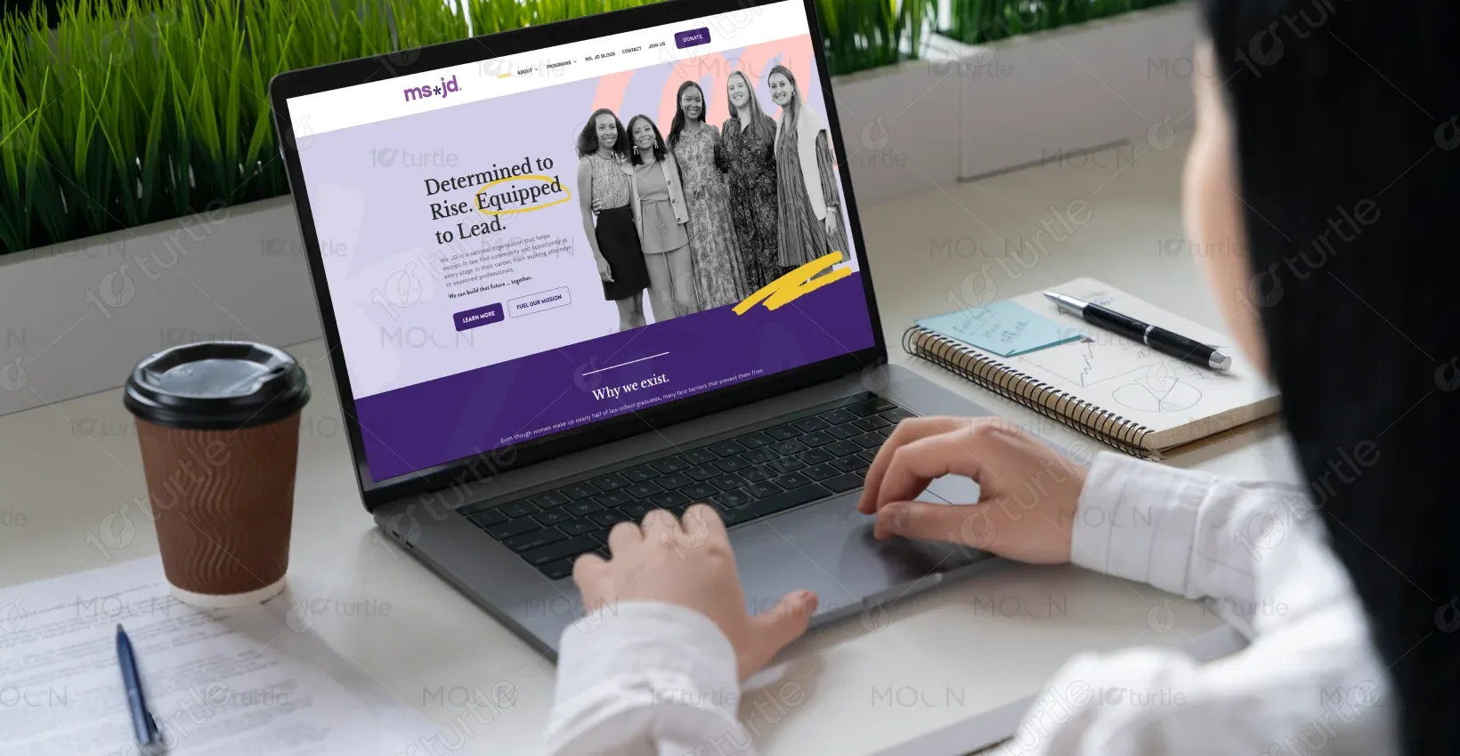
The goal of this project was to redesign the homepage into a clear, emotionally resonant, and mission-forward experience. The client wanted a design that communicated purpose, credibility, and warmth while showcasing programs and community impact. The scope included UX strategy, visual storytelling, and content hierarchy optimization.
Industry
Leadership Development & MentorshipWhat we did
User ResearchUI UX DesigningResponsive ExperiencePlatform
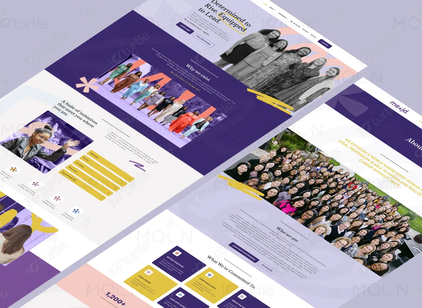
-The existing digital presence lacked clarity in storytelling and did not fully reflect the strength of the MS. JD community. Visitors struggled to quickly understand the organization’s mission, offerings, and impact. A stronger narrative flow was needed to inspire trust, engagement, and action.
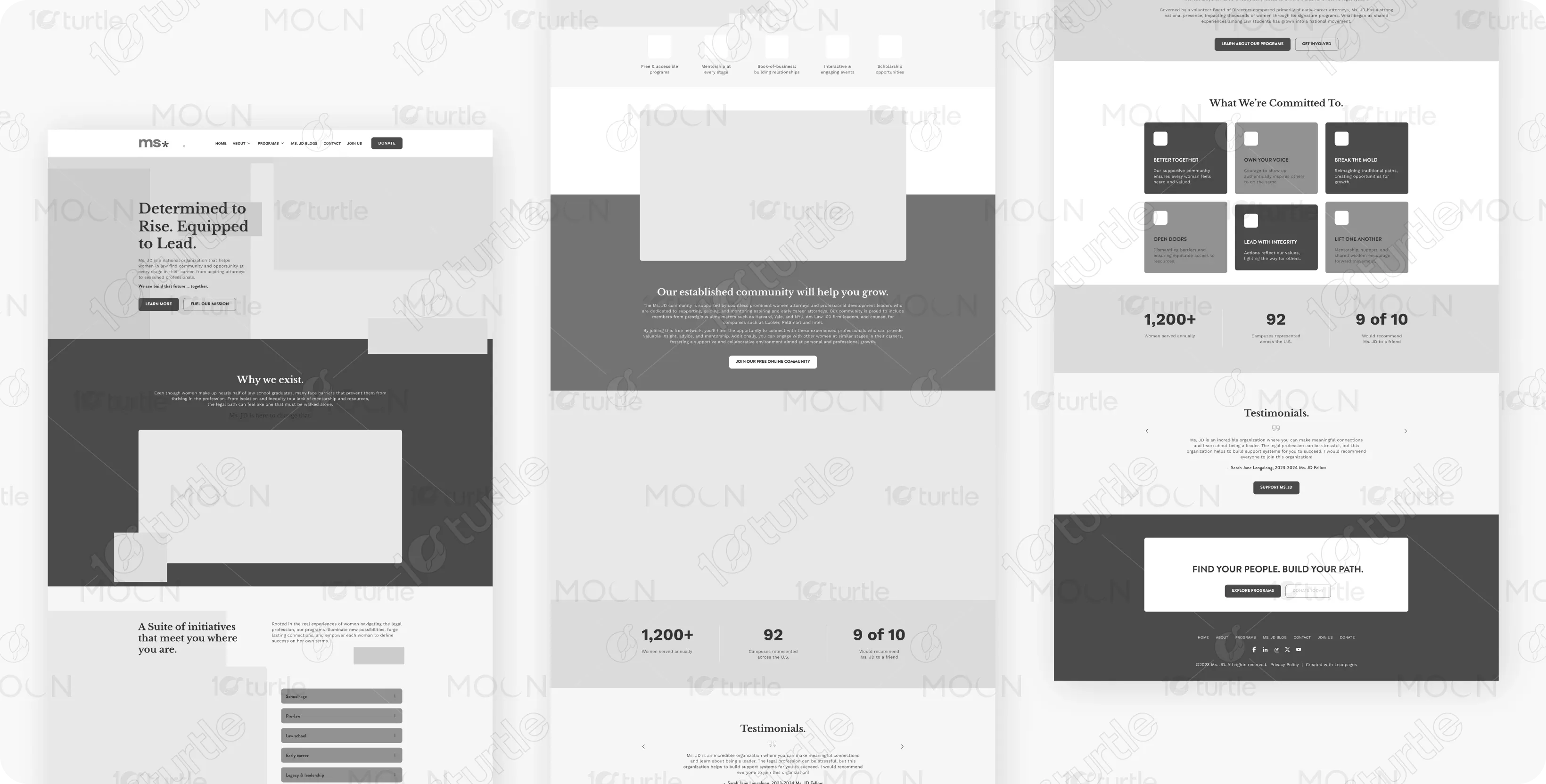
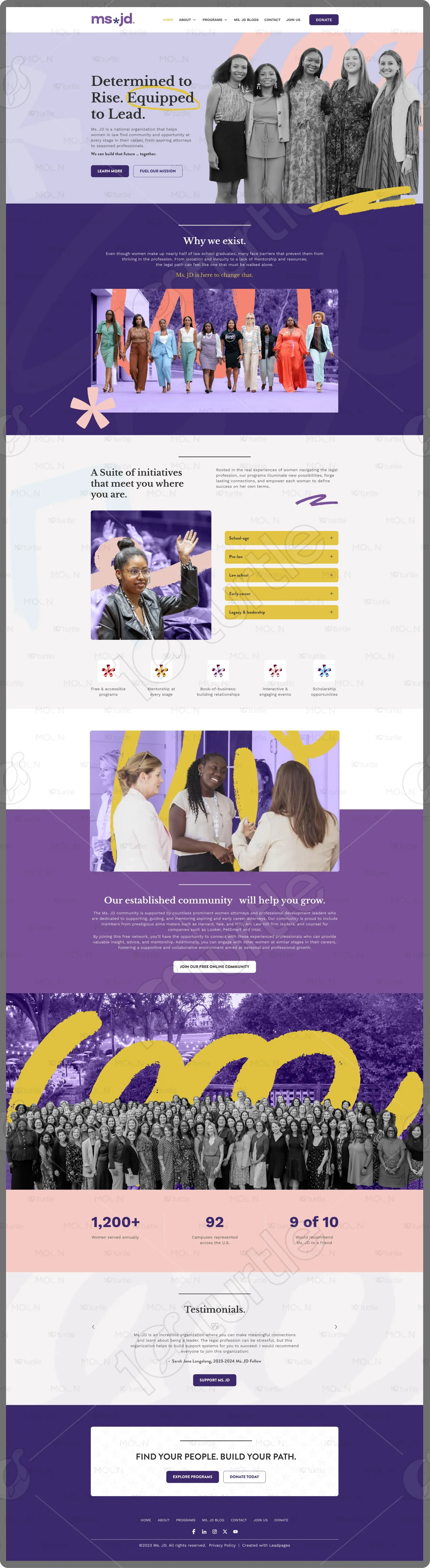
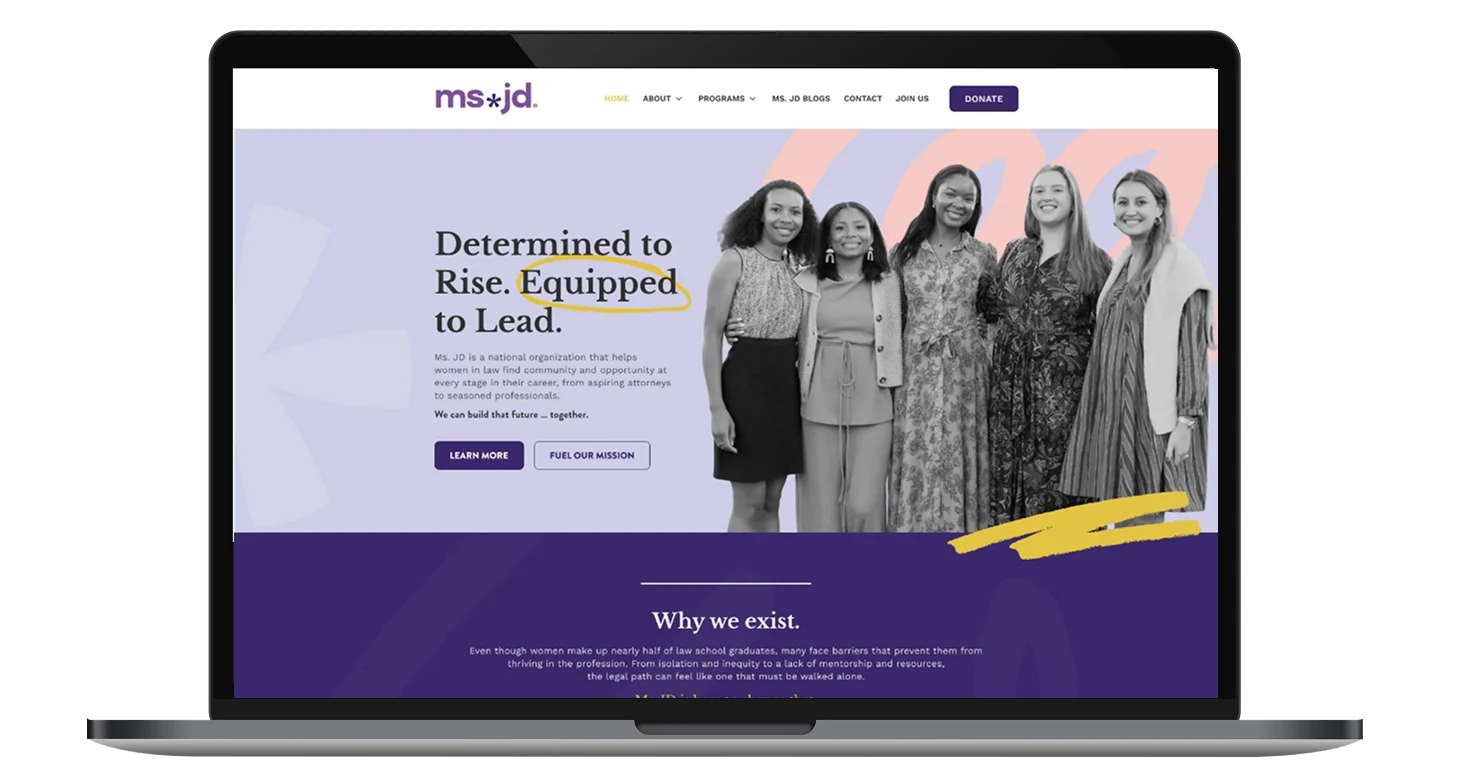
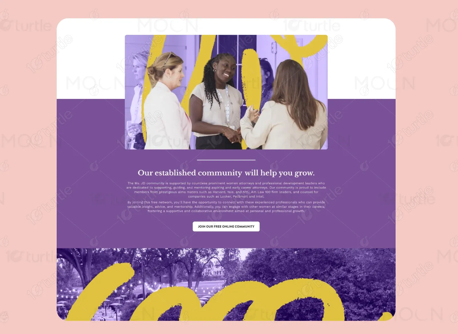
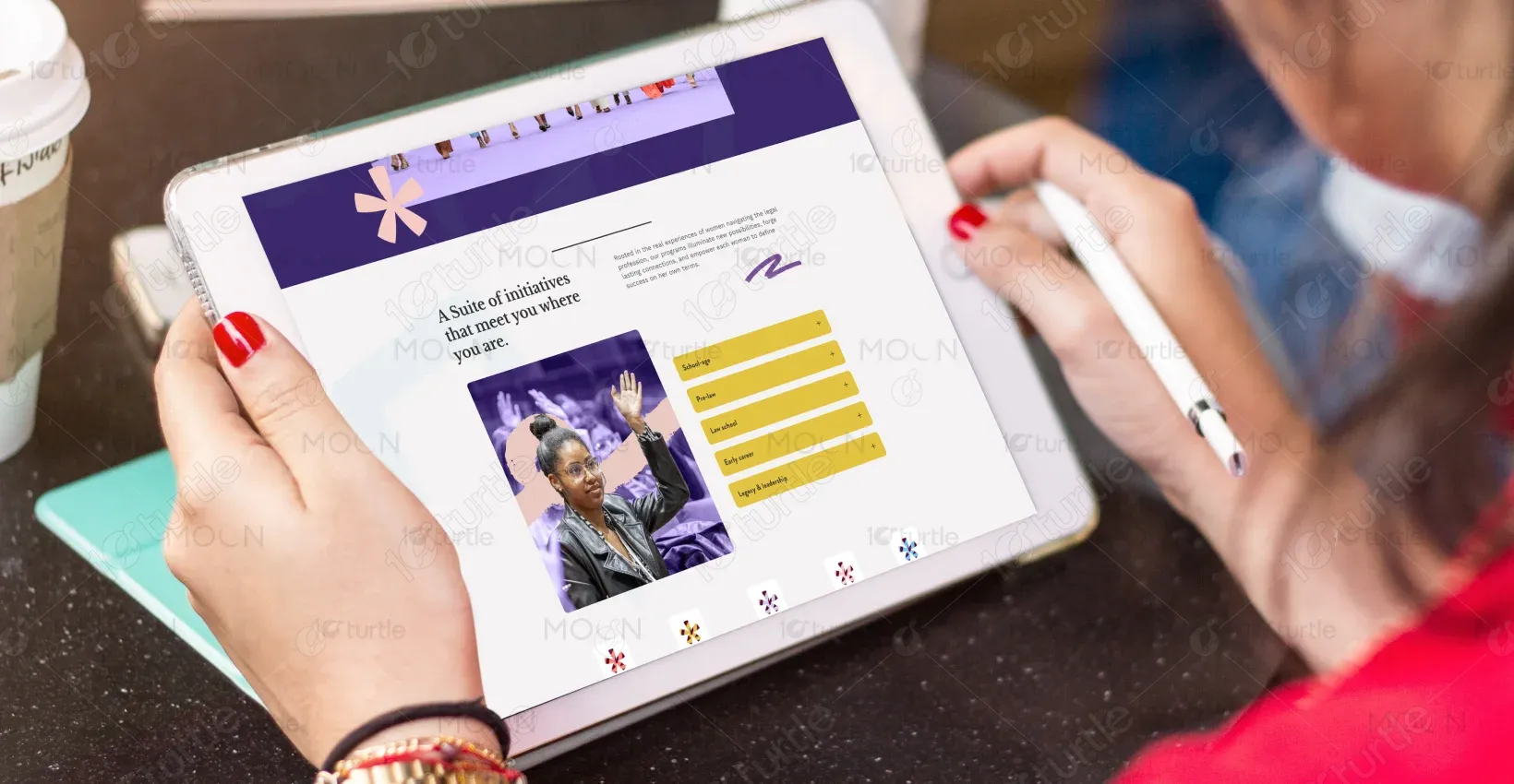
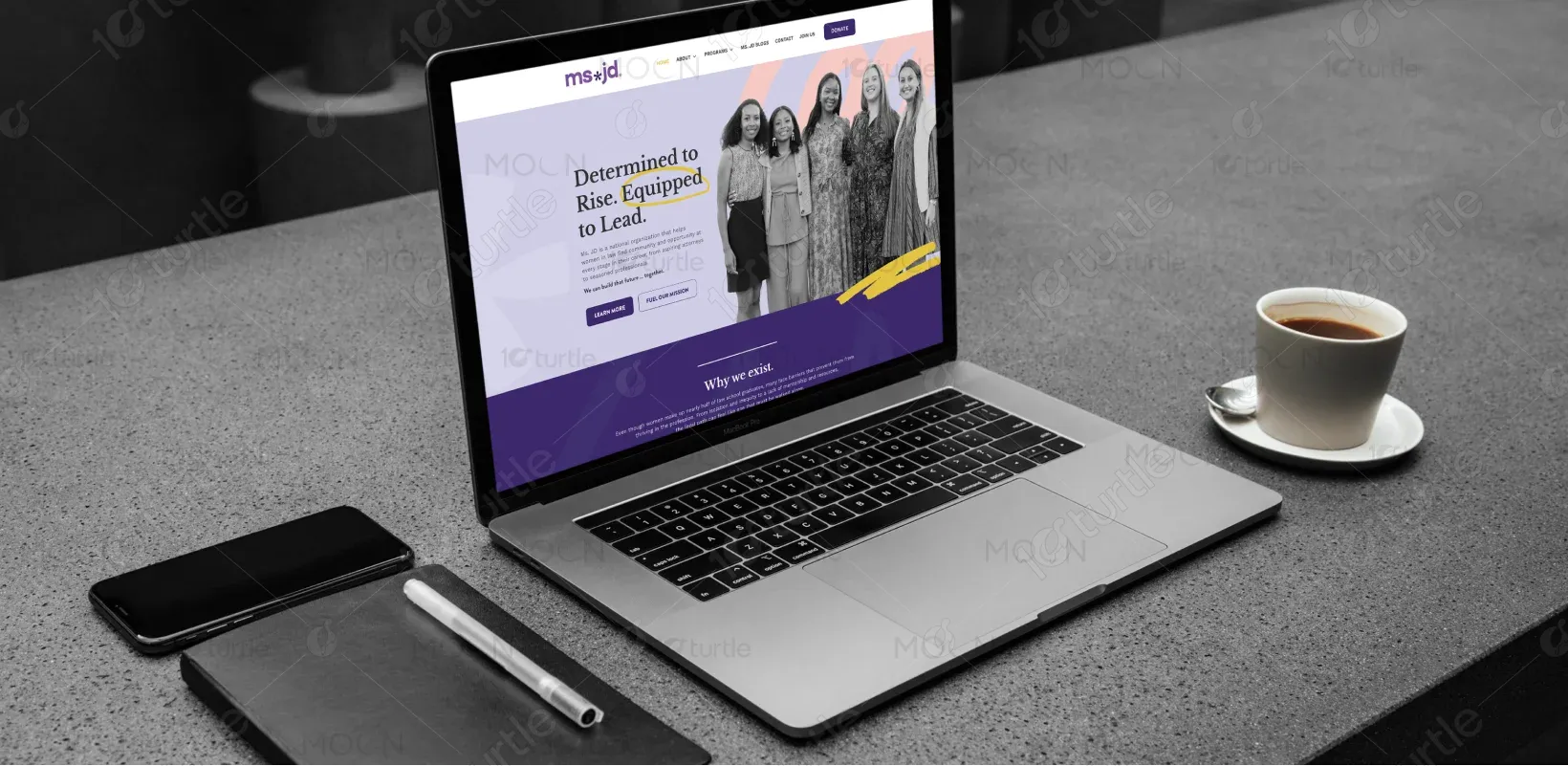
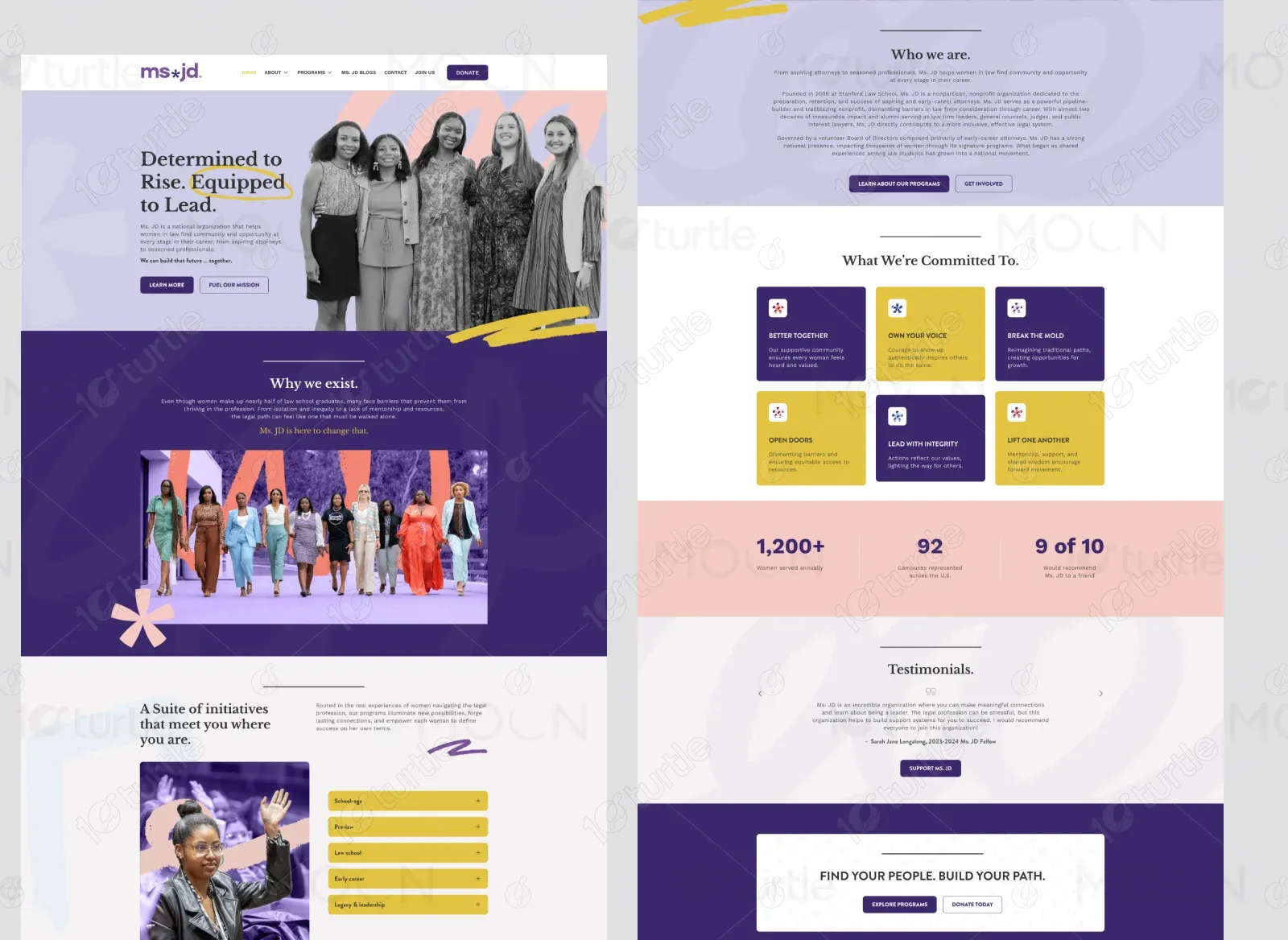
A structured, story-led homepage was designed to guide users through purpose, programs, and proof of impact. Bold headlines, real community imagery, and modular sections were used to create clarity and emotional connection. Clear CTAs encourage users to explore programs, join the community, or support the mission.
The client envisioned a bold yet welcoming design that felt modern, inclusive, and community-first. The aesthetic needed to balance professionalism with warmth, using expressive imagery, confident typography, and meaningful color accents inspired by advocacy and empowerment platforms.

The MS. JD logo is clean, modern, and typographically driven, symbolizing clarity and confidence. Its minimal structure allows it to work seamlessly across digital and print applications. The mark reinforces the organization’s focus on leadership, professionalism, and accessibility.
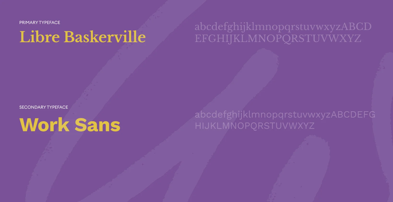
The palette centers around rich purples, soft neutrals, and warm accent tones. Purple represents leadership, ambition, and dignity, while lighter hues add openness and calm. Together, the colors create an emotional balance of empowerment, trust, and inclusivity.

Initial wireframes focused on narrative flow, ensuring each section logically built upon the previous one. Priority was given to mission clarity, program visibility, and impact metrics. The layout was structured to remain flexible for future content expansion.